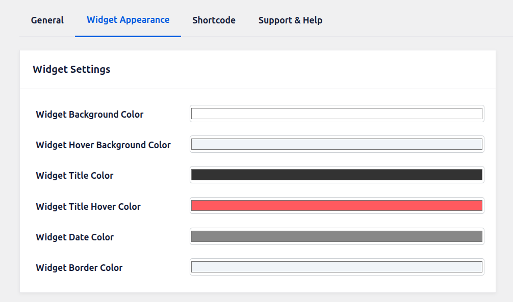
Widget Background Color: This setting allows you to define the default background color of the widget container. It controls the main visual area where all widget content (such as event titles, dates, and links) is displayed. Choosing an appropriate background color helps maintain consistency with your website’s overall design and ensures better readability of content.
Widget Hover Background Color: This option lets you set the background color that appears when a user hovers over the widget. It enhances interactivity by providing visual feedback on mouse movement. A subtle hover color variation is recommended to create a smooth user experience without being too distracting.
Widget Title Color: Use this setting to define the default color of the widget titles. This applies to the main headings or clickable event titles inside the widget. Selecting a clear and contrasting color ensures that titles are easily noticeable and accessible to users.
Widget Title Hover Color: This setting controls the color of the widget titles when a user hovers over them. It is especially useful when titles are clickable links, as it indicates interactivity. A distinct hover color improves user navigation and encourages engagement.
Widget Date Color: This option allows you to set the color of the date text displayed within the widget. Since dates are important informational elements, the selected color should be readable and visually balanced with the rest of the widget content.
Widget Border Color: This setting defines the color of the border surrounding the widget container. Borders help separate the widget from other page elements and improve layout structure. You can choose a subtle or prominent color depending on your design preference and theme styling.